

Triangle compositions
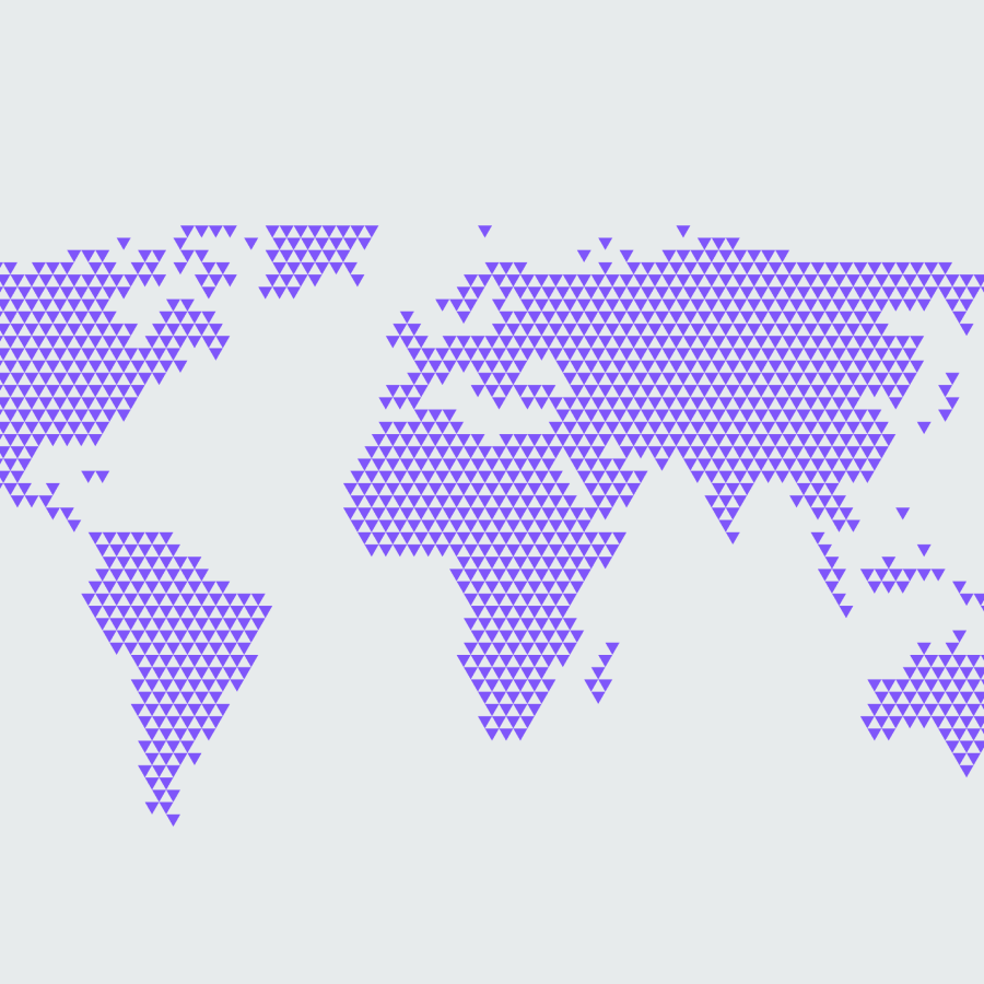
Triangle compositions are built from the same triangles as the rest of the system, but arranged into semi-figurative forms. Where patterns stay abstract, a composition resolves into something recognisable: a globe, a leaf, an upward arrow. They keep a clear link to the identity while carrying more expression and meaning. Use them for larger brand moments, editorial surfaces, and thematic storytelling.
Two types
Open is spacious, with room for content and layout. The form is present but light, leaving space for text and other elements to sit alongside it. Use it when the composition supports a message rather than being the whole message.
Focused is denser, with a stronger motif, clearer shape, and more visual impact. The form leads. Use it for standout moments where the composition is the hero.
Open
Focus
Keep the grain fine
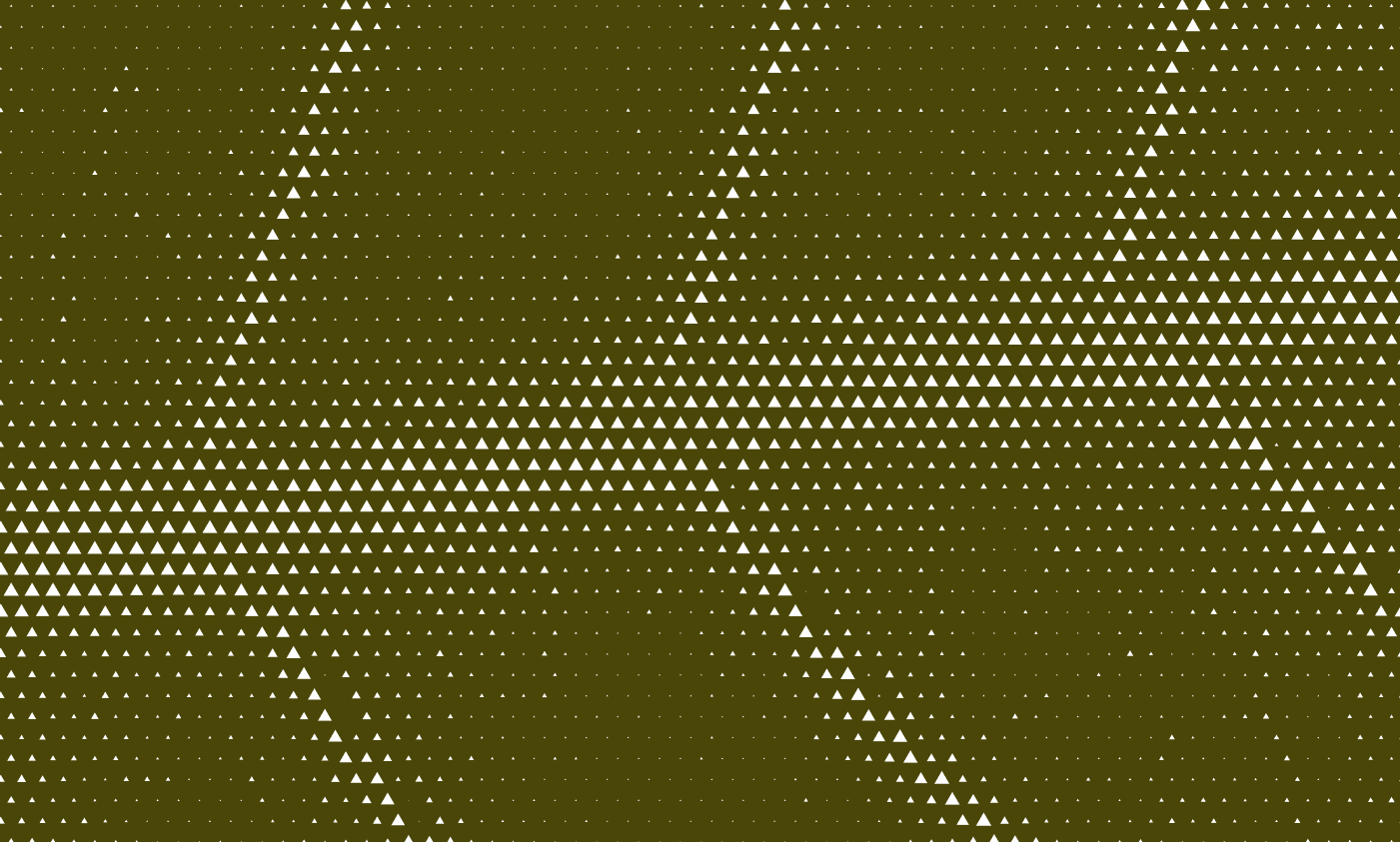
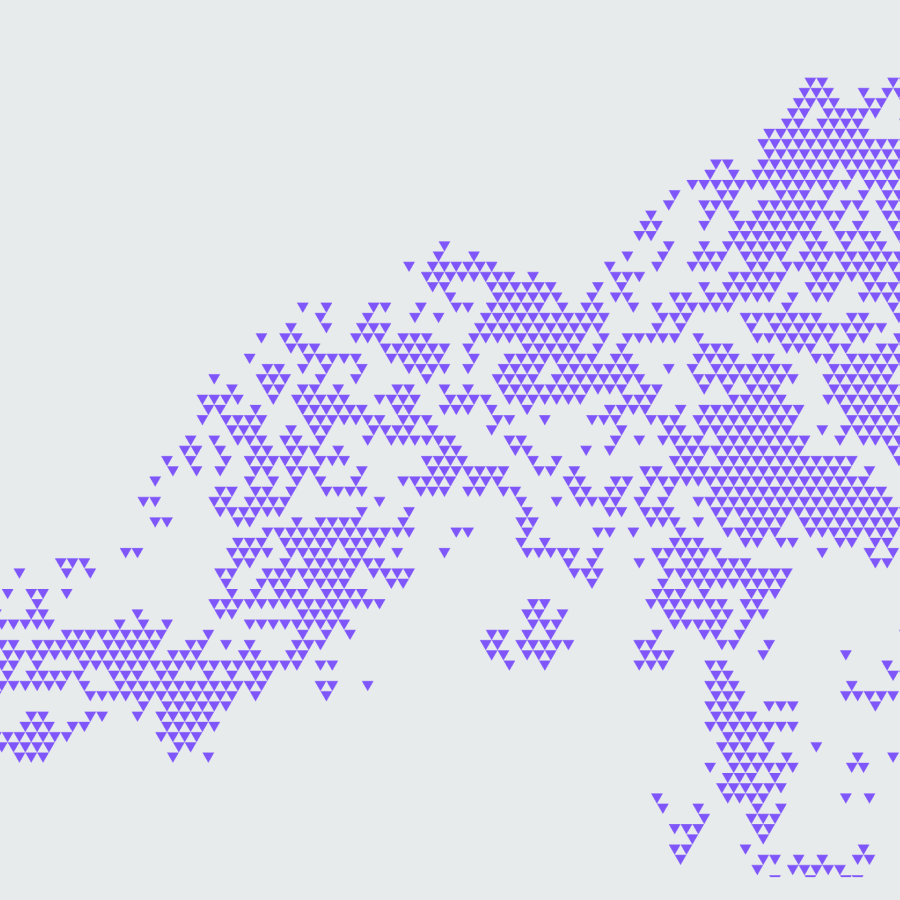
In a composition, the form should read first and the individual triangle second. Keep the triangles small and dense enough to dissolve into the shape. You can also vary the triangle scale organically: an even grid of uniform triangles reads as a blocky, low-resolution rendering of the shape, while a more organic distribution keeps the form fluid and expressive. If single triangles are dominating, scale them down or increase the density.
Do keep the grain fine.
Don't let the triangles grow so large they break the form.

No letters or numbers
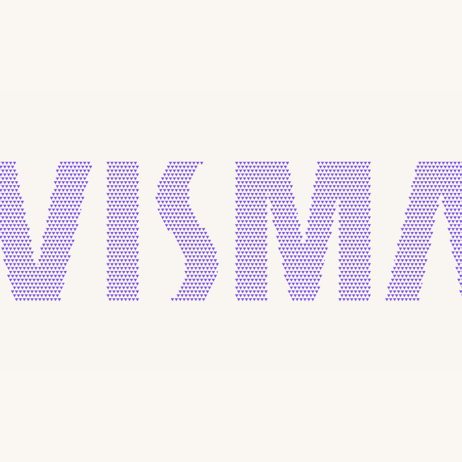
Do not build letterforms, numerals, or other typographic shapes from triangles. Forced into a glyph outline, the triangle stops being expressive and the letterform reads as clumsy. Type is the job of the typeface. Let the triangles form images, not words.
Don't build numbers from triangles
Don't build letters from triangles